Sunday, July 12, 2009

Today's Hate: The Logo/Colors of the New Dayton Gems

I owe my life to hockey. That's not an exaggeration, actually. My parents met and initially formed their relationship thanks to their love of the Dayton Gems franchise in the 1970s. My dad appreciated the hard-hitting style of the International Hockey League team. My mom appreciated that, too, but not as much as the (apparently) attractive, helmet-less players from what I've been told.

I wish I could have seen the Gems in their heyday. The IHL was Triple-A hockey back then, and Dayton had some great rivalries with the Toledo Goaldiggers, Columbus Checkers/Golden Seals/Owls, Port Huron Flags, Kalamazoo Wings and Fort Wayne Komets (among others). I'm sure it was great to see, especially the Gems logo and jerseys. Total classics. They even had a Houston Astros-esque Tequila Sunrise jersey, but I can't find a photo of it. Oh well.


I grew up a fan of the ECHL's Dayton Bombers. For those who don't know, the Bombers began their existance in the 1991-92 season as an affiliate of the St. Louis Blues and Dallas Stars and played at Hara Arena - just like the Gems. The Bombers had ups and downs and eventually moved to the Ervin J. Nutter Center in 1996. Unfortunately it eventually led to the demise of the club. The Nutter Center is just an awful place for hockey. I'm not trying to pile on the people at the Nutter Center because I don't know them, but they didn't seem to care about hockey and the building itself had no atmosphere at all. It's just stale and boring.

The Bombers finally went under this spring, and while that made me sad, it did lead to some good news: The Gems and the IHL (a new IHL at least) were coming back to Hara Arena. While I now live and work in Columbus, I was really excited about the new franchise - especially for my parents. Hara isn't in the greatest shape, but it's still a great hockey barn.

Then I saw the logo...

Ugh. Just ugh. How could they go from a classic to that? Nice job by whoever was using MS Paint. There's nothing good here. The colors match the seats at Hara, but that's not necessarily a good thing - especially in an area where blue and gold are not viewed as a positive. And putting "Blue and Gold" on the logo itself?!?! Really? Really!? If they wanted to use blue and gold, couldn't they have just recolored the old logo? If you want to do something new, cool. But that's just U-G-L-Y and it ain't got no alibi.

I can't judge the jerseys yet, as they haven't been publically unveiled. I hope they're better than the logo, but since they'll have that logo on them, they'll likely be ugly.

What's a real shame is that another old IHL/UHL/CoHL team, Quad City, has returned with new logos and it's awesome.

I love hockey, and I sincerely hope the Gems succeed. But I hate the logo and colors of the new Dayton Gems.

PS - I apologize for the lack of hate lately. I recently got married and that made me hate things less.

Thursday, April 30, 2009

Some Misc. Hate

(U-G-L-Y...You ain't got an alibi...)

The Lady From “What Not To Wear”
OK, so I love fashion and makeover shows. And I totally love it when others are embarrassed. That would mean I should love “What Not To Wear,” but I don’t. The lady host is just awful. Her name is Stacy London and she’s a bitch. This is the formula for a successful makeover fashion show: “Victims” who didn’t know they needed help + Quirky and adorable gay guy to help them along the way + Family to go apeshit over the makeover even though their loved one is still ugly and will likely go back to the way they dressed before = profit. They should dump this lady and her unusual graying hair.
Summer
Summer is coming and that’s … just horrible. Dear God I hate the summer. I don’t like hot weather. I grew up in a home that didn’t have central air. We had a pair of those portable ACs that you jam in the window, and let me tell you, that doesn’t work well. I have central air now, but the summer is still bullshit. If it’s above 75 degrees, I’m not happy about it. Especially because my office is usually around that temperature every day in the summer.
Melted Cheese
I know most everyone who will read this will think I’m crazy, but I can’t stand melted cheese. It smells bad, looks bad and I don’t want it. I like pizza, but only if there’s tons of toppings that cover the cheese and overwhelm the flavor. You know what’s the worst thing in the world? Mac and cheese. It even sounds awful when you scoop it out on a plate. I did the dishes for my family as a child and there was nothing worse than cleaning up after someone ate mac and cheese. It literally made me want to vomit.
Pants
I have a (kind of) typical office job. I’m there between 10 a.m. and 5 p.m. from Monday through Friday. I really like it except for one thing: Pants are required. I hate pants, especially when it’s getting warmer outside. My legs get hot and uncomfortable. If it were socially acceptable I’d wear shorts everywhere. Or just underwear. Fuck it. I’m going for comfort.
New NFL uniforms
Several football teams decided to change their looks for 2009 and they all get a big fucking fail. Here’s a quick rundown and my catty comments:
- Lions: New logo? Cool (although I don’t like the two white stripes above the lion’s arm). The helmet and jersey are awful, though. The helmet and jersey still have way too much black (read: any). And the typeface of the names and numbers are horrible, especially the No. 4.
- 49ers: The 49ers almost got it right. They ditched most of the black (as they should) and went back to a gray facemask and throwback striping on the helmet. It looks much better than before. The jersey is better with no unnecessary black trim. But the three stripes on the arm … ugh. Either do them the entire way around or don’t. That inbetween bullshit doesn’t work.
- Jaguars: The Jags had an OK look before, so naturally they decided to defecate on their old look. There’s nothing good about this look, especially the jersey piping, which is just an awful trend that needs to die a horrible death (preferably) in a fire. I think the pants striping is even worse.

The Craig Krenzel John Deere Commercial
I love Craig Krenzel. He’s probably my favorite Buckeye ever. But he must be broke…

Seriously? National champion Craig Krenzel “dotting the i” of a John Deere dealership?

Tuesday, April 14, 2009

Today's Hate: The Milwaukee Brewers

This week my beloved Cincinnati Reds begin their first road trip of the season in Milwaukee. Every time I see the Reds play in at Miller Park I come back to the same thought…

I fucking hate the Milwaukee Brewers.

First, I should start with the backstory. I didn't care about the Milwaukee Brewers as a child. They were an American League team, and seriously, fuck the AL with their "designated hitter" and "slighly better players." I remember they had a pretty cool logo - a "M" and a "B" that former a baseball glove that could only be used by a cartoon character.

Then when Arizona and Tampa Bay received expansion teams in 1998 the Brewers got a big gift given to them by former awful owner (and current awful commissioner) Bud Selig. With the addition of the Diamondbacks and Devil Rays, both the AL and NL had 15 teams. In order for the leagues to continue to play primarily intraleague games they would need an even number of teams. Thus Selig decided that one team from the AL Central had to move to the NL Central. Guess which one switched? That’s right - the team he used to own.

(He's probably thinking of ways to screw over fans - or the Astros)
It was a big boom for the Brewers, naturally. Milwaukee is a glorified suburb of Chicago as it is, so naturally the Brewers make money hand-over-foot when the North Siders invade. The only reason the Brewers moved to the NL was to help Selig’s former team and to give Cubs fans a cheaper way to see their team than paying to go to Wrigley Field.

I think my hatred of the Brewers also has a little bit to do with my hatred of Wisconsin as a whole. Have you ever spent more than a week there? I have and I advise against it. It’s boring. It’s like Indiana with fatter people. I don’t like cheese, hunting or Brett Favre, so I was greatly out of place when my fiancee and I spent two long, long years in the Dairy State. We recently drove through Wisconsin on the way to the first round NCAA Tournament games in Minneapolis. All it did was remind me of why I left in the first place. Instead of “On Wisconsin,” make it “Fuck Wisconsin.”

Here are some specific reasons why I hate the Brewers:

(You don't have to see home plate. That's not important. Also pictured: Stupid fans.)

· Miller Park - Here’s the thing about the Brewers’ heralded stadium: It’s stale and overrated. First, it’s in the middle of fucking nowhere. The fact you can tailgate is nice, but I’m sure the main reason you can there is because there’s literally nothing near the stadium. Once you find the stadium, it takes forever to wait to get to the parking area. And when you do get there, the parking isn’t that good. Even when there aren’t a lot of people at the game, the parking is still a mess. Then once you get in, you’re underwhelmed. I’ve been there when the roof is open and when it’s closed, and it’s admittedly tolerable when the roof is open. Otherwise it’s as stale as year-old bread. There’s no atmosphere at all. Most of the seats are high up and far from the field, and while there are window panels in the outfield, the view is of the parking lots. Wow.
· Their fans - There are some good and knowledgeable Brewer fans. I knew one when I lived in Wisconsin and we’d talk all the time about the NL Central. But in my two years in Wisconsin, he was the only one I ever met. There are a lot of Brewer fans now. They’re competitive after all. I’m pretty sure God (or whatever) created Brewer fans in 2005. Oh, and every time I read about how fans there are so friendly I wonder if they missed the games I was at. They were generally rude and ignorant when I was there.

(I have a coworker with blonde facial hair. It doesn't look good on him either.)

· Bernie Brewer - Sure. I’m a Reds fan, and we have a really lame mascot in Gapper, but Bernie may be worse. I know a lot of people won’t agree with this, but he’s stupid. “Oooh! He lives in a dugout in the outfield and slides down a slide when the Brewers hit a home run! How fun!” Fuck Bernie. And the sausages. If you’ve seen the Sausage Race once, that’s enough.
· Roll Out The Barrels - Stupid ass song. I had to hear it every time I was at a baseball game in Wisconsin, including at Miller Park. I hate that song. I’m glad I don’t have to hear it anymore.

· Fucking Bill Hall - As a Reds fan, Public Enemy No. 1 is Bill Hall. I went to 12 Reds-Brewers games in Milwaukee, and Hall ruined probably seven of them. The thing is he’s not even that good of a player! He just kills the Reds. I fucking hate Bill Hall. Through Monday, April 14, Hall is a career .258 hitter. But during his six-year career against the Reds, he’s hit under .300 only once. He hit his first career grand slam against the Reds, was one of five Brewers to hit a home run against Matt Belisle in the same inning (I was there, dammit!), drove in four runs as the Brewers rallied from a 9-0 deficit to beat the Reds, has had walkoff home runs and a fucking walkoff bunt against Cincinnati. I’m pretty sure he hit a bases-empty grand slam against the Reds at some point too.
He also appeared on the Young and the Restless. Douche.

There is no franchise that deserves the success it has less than the Milwaukee Brewers. I hate them. I am almost as happy when I read about bad things that happen to the Brewers and their “fans” than when I watch the Reds do well.

I hate the Milwaukee Brewers.

Tuesday, March 17, 2009

Today's Hate: Cats

First, a quick note: I am a big animal lover. I general, I like animals far more than I like people. I would never hurt any animal and I don't want anyone reading this to think I would ever hurt a cat in any way.

But cats are fucking awful.

There are two types of people in the world: Dog lovers and idiots. Dogs are generally dumb, messy and fiercely loyal. A cat couldn't care less whether you lived or died. They're totally indifferent toward your very existance. Cat people are dumb. Mr. Jingles doesn't love you.

But why listen to me? These videos show how evil cats are.


Hairballs. Cute. That's what I want to watch my pet do all day.


OK. I have to admit. This is funny, and I hate kids as much as I hate cats. But, still, Admiral Fluffy shouldn't be attacking the spawn.


This guy is just trying to do his job, but this asshole cat isn't ok with that. What a douche.


This is a video that shows it all. Cats are full of inactivity with short bursts of violence.


Cats are even involved in underground fighting tournaments. Check out this clip from the movie Bloodsport. Yes, that's a meowing cat you hear at certain parts. I have no idea why, but it makes sense. Perhaps there were cats in the crowd. Skip ahead to the 3:05 mark for one of the most noticable meows.

Of course I have a personal reason for this hate:

This is Butterscotch. He's the asshole cat my mom picked up as a stray when I was a junior in high school. Butterscotch has attacked me on several occasions, with the first coming on the first day we had him. My mom was holding him in the kitchen of our house, and when I came home from school and noticed him, I went to pet him. Butterscotch leapt from my mom's arms and clawed me. He was going for my eyes, which I closed a split second before he scratched me. He cut my eyelid.

Over years he has attempted to smother me in the middle of the night by laying on my face while I slept, peed on several of my things (pillows, clothes, etc.), shit on the walls (don't ask) and has clawed and bitten me on several occasions. He tries to act like he rules my parents house, but he's an indoor cat. He used to try to go outside, and one time he got out and was out all night. We found him the next morning dirty, scared and hiding under the air conditioner. Pussy.

He used to tease our dog, Spydel, who I loved because she - like all dogs - are great. Butterscotch would bat Spy, and she'd growl. He'd do it again, and she'd grow. He'd do it a third time, and she'd snap and try to bite him. Spy always missed (perhaps intentionally), but I always wanted her to get him once.

Butterscotch, like all other cats, are jerks and I hate them.

Tuesday, March 3, 2009

Today's Hate: Unnecessary Black In Sports Uniforms

Those who know me know that I’m a big fan of Paul Lukas’ Uni Watch blog. I’m a visual guy, and I’m anal about what I see - especially when it comes to sports. I notice the things that make up Athletics Aesthetics - the logo changes, the color differences, the misspelled names on the back of jerseys. Yeah, I’m a really lame person.

So it’s no surprise that I’m well aware of my alma mater’s plans to debut an alternate jersey on national television this Thursday. I follow many sports teams, but none closer (or with more emotion attached) than the University of Dayton men’s basketball team. There’s nothing I love more than Flyer hoops. I bleed red and blue.

That’s why what the Flyers are going to wear on Thursday against archrival (and future hate subject) Xavier bothers me so much.


I said I bleed red and blue. I don’t bleed black.

There has never been black in Dayton’s color scheme. When I was younger, the Flyers wore red and light blue (what I call Marian blue - based on the Marianist chapel in the middle of campus). They picked up a darker blue over the years and phased out the Marian blue. Still, there was never any black. Ever. Adding unnecessary black to your jersey/logo/whatever is fucking stupid. It’s also straight from 1995. It’s really my No. 1 hate when it comes to my love of sports logos/uniforms.

There have been plenty of teams, professional and otherwise, who have added unnecessary black to their color schemes. And it’s pretty much never looks good. Teams that have classic looks has basically tried to ruin it by adding black. Check out the Mets, A’s and Blue Jays (yes, BLUE! Not black!). At least the Royals had the sense to drop their black unis in favor of a light blue 80ish version like one they used to wear.

I understand why UD and all of these other teams have added black over the years - money. Take UD for example. The Flyers have worn four different jerseys already this year. That’s not including the black but including the awful Nike System of Dress white and red jerseys that have no trim and are templates other teams use. Times are tough right now and if you can sell more stuff by adding alternate jerseys, cool. I’m totally fine with this if you do it right. Over the past couple of years, UD has done a great job. Last year they wore a different Marian blue jersey and wore a checkered jersey based on an 1980s look. Both of those were great. They were a part of UD’s history and both jerseys were well done. I even own one of them because I think the Marian blue should be a part of the permanent color scheme.

But black is simply uncreative and played out. The Mets should drop it. The Reds should lose it, too. If you’re ever at the Reds game you’ll be able to spot me right away. I’m the only person at the game with an all-red Reds hat with a white wishbone-C with no black drop shadow like the current hat has. That’s how much I don’t want to wear any unnecessary black.

And why would UD wear black at Xavier for fuck’s sake! Dayton hasn’t won in Cincinnati against X since January 1981. I was negative eight months old!

BAH!

Why stop at black though? Let’s just add a bunch of other UD jerseys that make no sense at all.


How about orange?


Tennis-ball green?


Pink?


How about we just add Rudy (our mascot’s head) on a fucking jersey and get it over with?!

What’s the worst part? Fans like black jerseys. Do you know why? Because most people are fucking stupid. Don’t believe me? Here’s an example of the fan reaction to the black UD jerseys from the UD Pride message board in recent weeks:

“black is really just a base color for pretty much all sports teams. kind of like white or gray. yes, some teams use it as their primary, but a lot of teams just use it to make a cool alternate (like UD in this case). these unis sound sweet idk why you would call them pointless. lets just toss the old school blue out too. matter of fact, lets just wear plain t shirts with only read and blue. you know what? lets just kill fun all together. really dumb post man.”
First, shananagans on black being a base color for all teams. Is black a part of the Yankees color scheme? The Lakers? Red Wings? No, so fuck you. Second, the light blue is a part of UD’s history, moron. I don’t want to kill the fun, but I wouldn’t mind if you went and played in traffic.

“Havent seen the black but I do like the alternate columbia blue and retro. Im still waiting to see a khacki home or road alternate."
First, it's “khaki,” and no.

"I'm excited to see these black uniforms. They can't look any worse than the light blue jerseys."
Die in a fire.

“these look even better than i imagined!”
You have no imagination. And die in a fire.

“I vote for the black unis.”
I vote for your expulsion from Earth.

“wear the black unis, they look tight and will have everyone who tunes in around the country ooooooing and aahhhhhhhhing over our spiffy new look. plus, our road jerseys (red ones) are weak sauce.”
I guarantee you that no one will be ooooooing or aahhhing over the black uniforms. Most people with either not notice because we’re never or TV or wonder why they thought black was a good idea when it’s not.

Bah.

Tuesday, February 24, 2009

Introduction & Today's Hate: Bad Oscar Fashion

First, an introduction. My name is Matt and I live in suburban Columbus, Ohio. I am a page designer for a sports publication company in central Ohio. I am 27-years-old and live with my loving fiancee, Lindsay, and my evil rabbit, Lord Hoppington.

I am generally a nice, quiet person. I just happen to hate many, many things. It is a big source of humor where I work and among my friends. This blog will be a way for me to make my feelings known to the world. I really expect no one to read this, but I will try to update it at least once a week with a new subject.

With that out of the way, my first subject is Bad Oscar Fashion.

Some people call the Academy Awards the Gay Super Bowl. I can understand that. For me, as a straight man who loves many of the same things a gay person does, I totally love red carpet fashion even though I like the Super Bowl more. I'm addicted to Project Runway and that has made me a fashion follower. I don't understand why some things in fashion are popular, but I know what I like and what I hate. And I like watching pretty people dress up in pretty dresses.

I don't care what that says about me, either.

Yet not all of the pretty people dressed well on Sunday. Here's today's hate - Bad Oscar Fashion.


Jessica Biel
First, I have to ask - why was she there again? I don't think Blade 3 was nominated for an Oscar. I think she was just there to show everyone how not to dress. I can see how the thought process had to go as her stylists (who obviously hate her) helped her decide what to wear: "Let's find something to totally make her look fat. Let's also make sure it's totally unfinished at the bottom so you can't see her shoes (which will be horrible anyway)."


Marisa Tomei
Where's the color, sweetie? And I. Cannot. Stand. Asymmetrical. Dresses. It's just a personal preference, but I think it looks sloppy. The dress is way too busy, too.


Beyonce
I absolutely appreciate a girl with curves, but I wish Beyonce would hit the breaks. A mermaid-shaped dress on that body? Really?! And she's wearing my grandma's couch.


Amy Adams
I loved her green dress last year. I hate this. The jewelry is cool (a minority opinion perhaps), but you can't wear red on the red carpet. It's got to be a little darker shade or a little lighter. It just doesn't work for me. And I don't like how fabric just drapes down the front. It takes all shape away.


Heidi Klum
I love Project Runway and Heidi as the host. That being said, she looks horrible here. The accessories are way, way too much. And it's red. And it's asymmetrical. And she kinda looks hoochie. That hurt to type. Auf Wiedersehen, Heidi.

Miley Cyrus
Miley is 16 years old, but she continues to dress like she's 36. This is actually the best she's looked all awards season, but that's not saying much. The skirt's too busy for my tastes. I don't hate the belt, though.


Penelope Cruz
A) I don't ever have a clue what she's saying, and that annoys me. B) I wonder where her groom is because she totally wore a wedding dress. C) Her main accessory? Crow's feet. Zing. Yeah, I said it.


Vanessa Hudgens
It's not awful, but a bird must have literally exploded on her bust. I think that might be what happened to the birds that hit the plane that had to land in the Hudson River. And I hate the bottom. I also don't really know who the fuck she is.


Frieda Pinto
Total points for wearing an actual color, but the top is totally distracting. I'm fine with everything from the waist down. And, once again, it's asymmetrical.


Sarah Jessica Parker
She looks like she's going to a wedding, too. I guess that's supposed to be ironic since Ferris Bueller is soon going to realize he could do better. The top doesn't fit right. Her boobs make me hurt. (Ed. Note: Lindsay tells me the dress is actually mint green, which I couldn't tell until I saw a close-up on TV. Still don't like it though.)


Whoopie Goldberg
Ugh. Next!


Tilda Swinton
Actually, wait Whoopie, come back! What the fuck is this?! You're literally wearing half a burlap sack. Just awful. She's clearly the worst dressed, and it wasn't close. Oh, and the black bow on the skirt makes it look like she's hiding a package if you know what I mean. I was watching Fashion Police on E! and she was listed as a best dressed, which initially made me angry until I realized who the judges are. Debbie Matenopoulos wears shoulder pads for goodness sake.


Kate Winslet
The night's big winner just looked old. The hair makes her look like Hilary Clinton and the dress is too "old Hollywood." And would someone tell her to go brunette or back to red? Blonde doesn't work for you, sweetie.

In case you're curious, my best dressed are Angelina Jolie (It's black, but I love the earrings!), Anne Hathaway (The detail is fantastic), Natalie Portman (It's not the greatest ever, but the pink and the details are cool.), Tarjai P. Henson (It fits her perfectly and the necklace is awesome.) and Alicia Keys (The purplish pink works.).

Finally, here are a couple of topics I know I will touch on in the coming weeks. These are all things I hate:

- Cats

- Kids

- Pants

- The designated hitter

- Optimistic sports fans

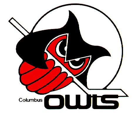
- Ugly uniforms (I'm a big Uni Watch guy)

- Most things about religion

- What has happened to Heroes after the first season

- ABC after the network canceled Pushing Daisies (Assholes.)

- The judges' decision at the end of Project Runway seasons one, two (especially) and five.

- Xavier University (UD grad, represent)

- Being a fan of a perpetually disappointing sports team (Reds, Blue Jackets, UD basketball)

- And much, much more...