I wish I could have seen the Gems in their heyday. The IHL was Triple-A hockey back then, and Dayton had some great rivalries with the Toledo Goaldiggers, Columbus Checkers/Golden Seals/Owls, Port Huron Flags, Kalamazoo Wings and Fort Wayne Komets (among others). I'm sure it was great to see, especially the Gems logo and jerseys. Total classics. They even had a Houston Astros-esque Tequila Sunrise jersey, but I can't find a photo of it. Oh well.

I grew up a fan of the ECHL's Dayton Bombers. For those who don't know, the Bombers began their existance in the 1991-92 season as an affiliate of the St. Louis Blues and Dallas Stars and played at Hara Arena - just like the Gems. The Bombers had ups and downs and eventually moved to the Ervin J. Nutter Center in 1996. Unfortunately it eventually led to the demise of the club. The Nutter Center is just an awful place for hockey. I'm not trying to pile on the people at the Nutter Center because I don't know them, but they didn't seem to care about hockey and the building itself had no atmosphere at all. It's just stale and boring.
The Bombers finally went under this spring, and while that made me sad, it did lead to some good news: The Gems and the IHL (a new IHL at least) were coming back to Hara Arena. While I now live and work in Columbus, I was really excited about the new franchise - especially for my parents. Hara isn't in the greatest shape, but it's still a great hockey barn.
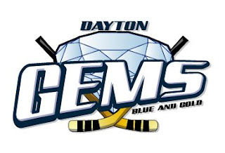
Then I saw the logo...
 Ugh. Just ugh. How could they go from a classic to that? Nice job by whoever was using MS Paint. There's nothing good here. The colors match the seats at Hara, but that's not necessarily a good thing - especially in an area where blue and gold are not viewed as a positive. And putting "Blue and Gold" on the logo itself?!?! Really? Really!? If they wanted to use blue and gold, couldn't they have just recolored the old logo? If you want to do something new, cool. But that's just U-G-L-Y and it ain't got no alibi.
I can't judge the jerseys yet, as they haven't been publically unveiled. I hope they're better than the logo, but since they'll have that logo on them, they'll likely be ugly.
What's a real shame is that another old IHL/UHL/CoHL team, Quad City, has returned with new logos and it's awesome.
PS - I apologize for the lack of hate lately. I recently got married and that made me hate things less.
No comments:
Post a Comment